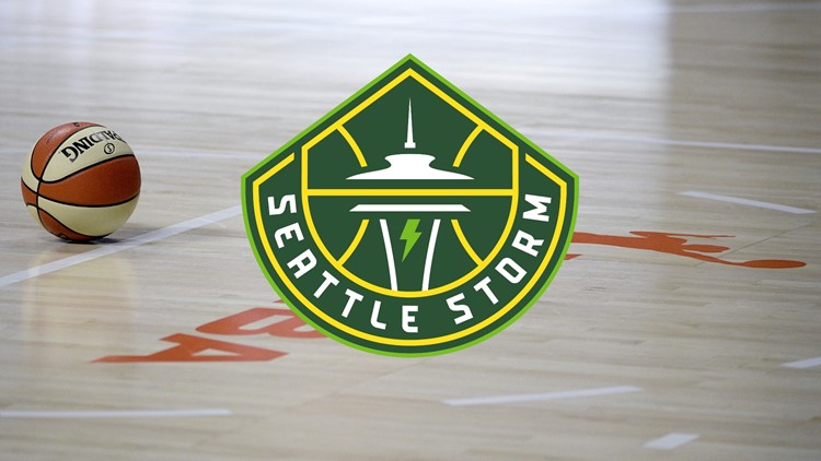
SEATTLE — Coming off the heels of the team's fourth WNBA championship, the Seattle Storm are going with a new look. On Tuesday, the Storm unveiled its new logo.
The new version's primary colors are called Lightning Yellow, Thunder Green, and Bolt Green by the team.

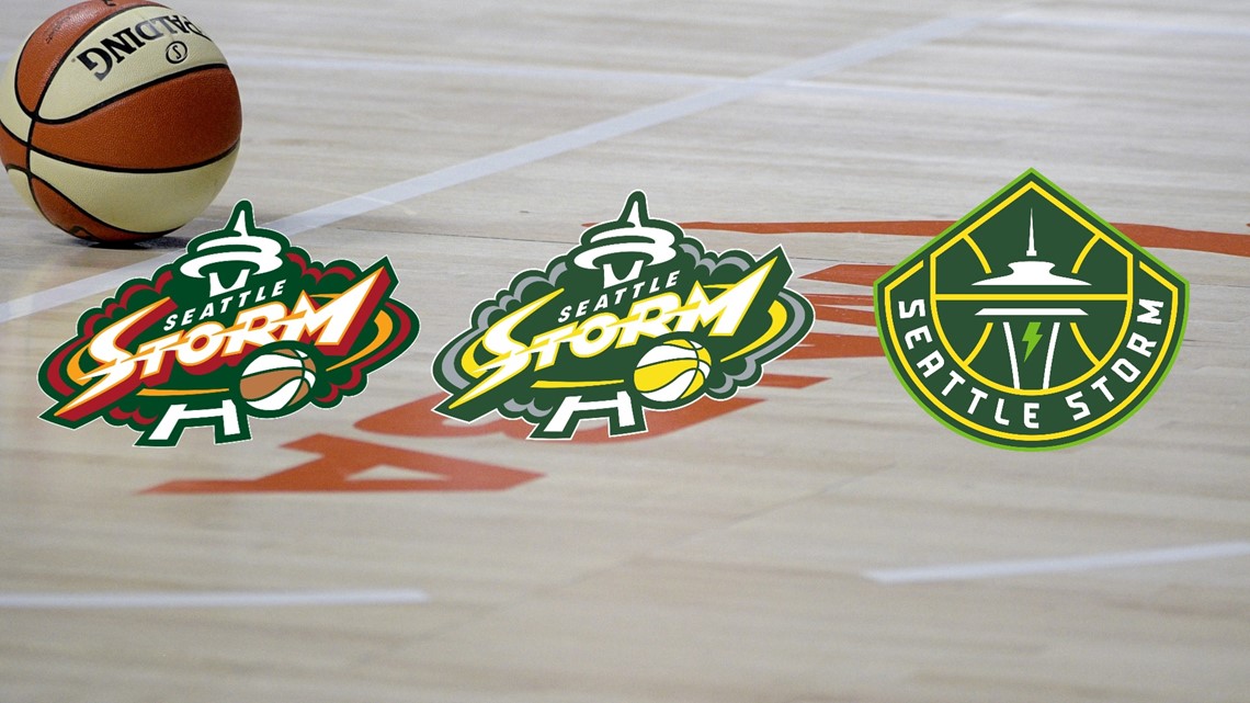
It's the team's third logo in the franchise's 21-year history, but the first one that distinctly stands out from the rest.
Below is a history of all three. The one on the left was Seattle's first logo. It represented the Storm from 2000-2015. The middle logo represented the Storm during two title runs, and Seattle used it from 2016-2020. The far right logo is the newest one, just announced Tuesday.

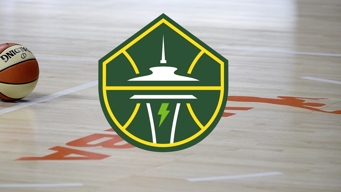
The new logo uses the Space Needle inside a basketball, with the peak of Mount Rainier at the top, and a lightning bolt.