
As residents across Western Washington click refresh on air quality maps, hoping for any sign of relief, they may notice conflicting information. Some maps show varying levels of unhealthy air, even though maps use the same data.
KING 5 asked the Washington Department of Ecology about this, and the short answer is that different maps interpret the same data in slightly different ways.
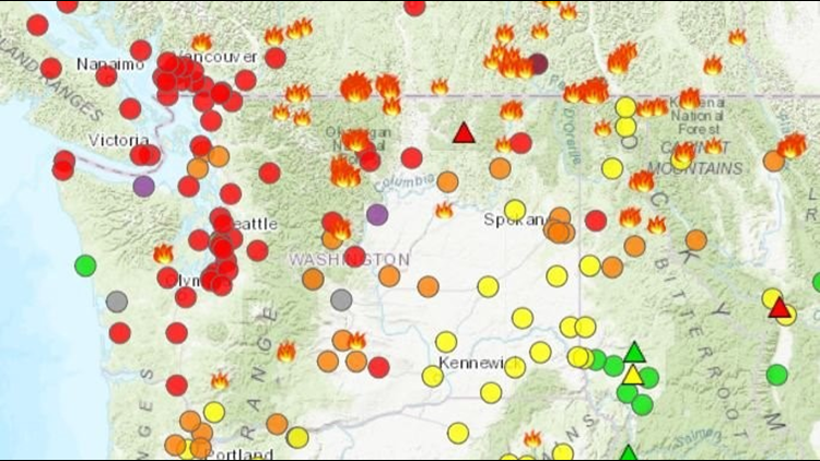
Take, for example, the Washington Smoke Information map, which is a partnership between state, county, federal agencies, and Indian tribes.
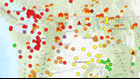
On Tuesday, that map showed smoke levels as “unhealthy,” with red dots across the Seattle region.
The Washington Department of Ecology smoke map, which uses the same data, showed purple “very unhealthy” dots across Seattle.
So why the difference?
According to an Ecology spokesperson, since the Washington Smoke Information map involves federal agencies, it therefore uses national standards for determining air quality. Those standards are a little less strict than state standards.
Washington standards, reflected on the Ecology smoke map, tend to be more cautious about human health, even though numbers behind the maps are the same.
Despite the differences, the Washington Smoke Information map is considered the most up-to-date, accurate resource in Washington, and there is no reason to think it is any less reliable than the ecology map. It just uses slightly different standards for health, the spokesperson said.
Some maps, such as EPA AirNow, display AQI (air quality index), which pulls together multiple air characteristics, besides just smoke, to determine the air's cleanliness.
During smoky conditions, it’s more useful to look at maps displaying just the smoke particulate matter in the air, since that’s the main concern.
All maps are experiencing high volumes of traffic and may not load this week, so it helps to have multiple maps displaying the info.